Apothecary Logo Redesign
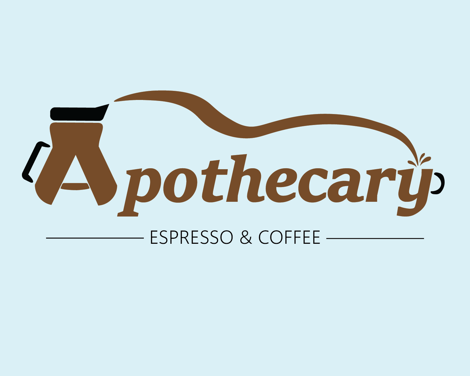
With this local redesign, I wanted to lean into the whimsy of the word Apothecary. In modern media, an apothecary always seems to be a magical place where you go to be healed or refreshed. I felt that giving this logo a bit of flow with the pouring of the coffee stream, gave it that bit of whimsy. Playing with the shapes of the letters to create the common visuals of a coffee shop also added to this feeling.