Sushi House Logo Redesign
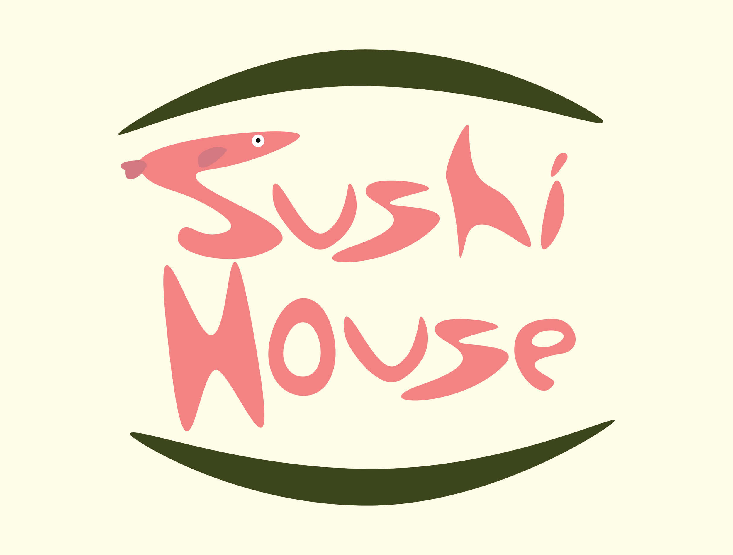
I frequent this restaurant often and I find that their flavors are bold and original, something that wasn’t represented well in their current branding. I wanted to bring some character to the logo that represented these flavors well. For the text, my goal was to create a font type that was unique, but not bland either. I really enjoy turning the shapes of letters into other objects as I did here with the first “S” looking like a fish. I feel that it brings the type of character that I was looking for when I started this personal project. Finishing the logo off, I thought that adding the curved shapes gave the feel that you were looking at a sushi roll, just another fun touch to the overall feel I was going for.